


Our website redesign project has moved solidly into the Design and Build phase this summer, and we’ve been stretching to find new ways to get on-going feedback. In this post, we’ll explain one low-tech method we used for soliciting feedback from library staff by incorporating everyone’s favorite summer treat: ice cream.
Why
As part of the website redesign process, our web designer Patricia Villanueva created a number of possible header and footer designs to use on the new website. These designs were based in large part on earlier user testing research that we had done (including the projects we’ve talked about on this blog). The WebRAT team reviewed the whole set of designs and narrowed the field down from 20 headers to a set of 6 possibilities, and from 15 to 5 footers.
To get feedback on those designs, we decided to turn to the rest of the library staff. We know that we still have to do testing with external users (and are making plans to do so!), but library staff are important users of the website, too. Additionally, soliciting feedback from staff gave us a way to talk about the redesign with library staff and give them a chance to get involved.
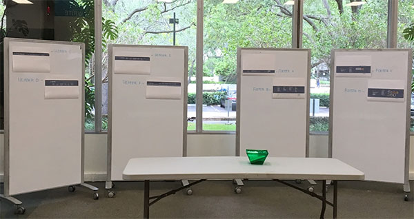 Mockup Boards Setup
Around the time that we were planning this, the library was holding a summer ice cream social event for all library staff. We were given permission to set up a small feedback area in the space where the ice cream social was held. This let us not only reach a wide range of library staff, but do so in a casual, low-stakes environment.
How
Since the ice cream social was already planned and advertised, we didn’t have to worry about recruiting participants. To keep things simple, we used paper printouts of the proposed designs. We printed out copies of various mockups (6 headers and 5 footers) and taped them to whiteboards. To provide a realistic impression of what the headers and footers would look like as part of a website, we included some greyed-out content along with the header/footer mockup. After trying a few variations, we settled on some plain text that was blurred and considerably lightened in color, which kept the focus clearly on the headers and footers.
After discussion of various methods of voting, we decided to give each person four stickers: two for headers, and two for footers. They could then use those stickers however they wanted - give both stickers to one header, or give one sticker each to two headers. We also provided index cards for people to write comments on specific designs, although few people took advantage of this option. However, since we had at least one member of the redesign team on hand for the entire activity, we were able to get informal verbal feedback and listen in on conversations about the designs as people participated.
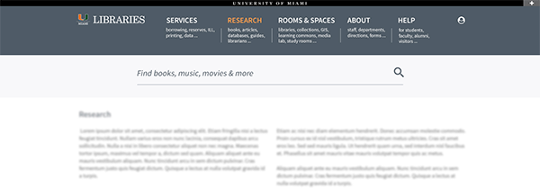 Example Header
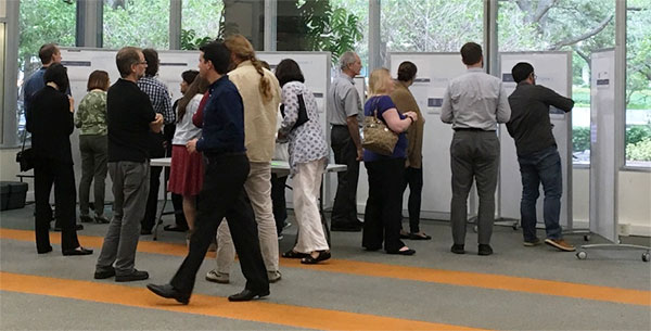 Staff examining mockups
In introducing the activity, we tried to emphasize that we were primarily interested in feedback on the designs themselves, not on the colors or labels of categories. We also emphasized that this was only a preliminary test of mockup designs; the final designs may (and probably will) look very different.
Results
With nearly everyone at the ice cream social involved, we were able to gather a great deal of information on the preferences of library staff and faculty. The voting helped us continue to narrow the potential options, down to 3 designs each for headers and footers. That gives us a good number to continue exploring and doing more user testing with. Since each proposed design included a variety of different elements, we may continue exploring some elements even from the designs that did not receive many votes. While preparing the designs, we had some predictions about which designs would be the most popular, and for the most part, those were born out by the voting. Though we had some of our predictions confirmed, the feedback helped verify that we are on track.
The activity also achieved its secondary purpose in keeping staff informed about the redesign. Those who participated seemed to appreciate the chance to see the design work as it was going on, including the range of designs under consideration, and we were pleased that everyone seemed generally positive about the direction we are headed.
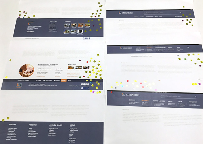 Mockups with sticker votes
What’s Next
The UX Team is currently thinking about how to do a version of this activity with students and other library users. We want to provide a quick, simple way for students to indicate what designs they like, while also providing some more focused feedback.
While the stickers were effective and fun, making for an approachable testing activity, they didn’t provide much information about why one design was preferred over another. We also worried about bias towards visibly popular options - if one design already has more stickers, is someone more likely to vote for it? To help counter some of these problems, we are exploring other ways of framing the activity, such as setting up an A/B comparison activity on iPads set up in public areas of the library.
Keep an eye out for these testing activities and other ways to provide feedback on the new site!