

As part of the discovery phase of the website redesign process, we of course wanted to get insights from the primary users of the library’s website: students. The libraries’ User Experience (UX) Team conducted two types of user experience research, with more to come as we move into the design and prototyping phases. Through these tests, we improved our understanding of how students use the library website, what they are looking for on the site, and how we can make it as easy as possible for them to access library resources and services.
Card sorting
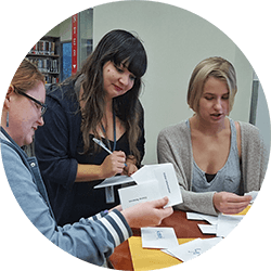
To test how information on the website should be organized, we conducted a type of usability testing called card sorting. In this test, users are given cards indicating pages of the website and asked to organize them in a way that makes sense to them. We used a combination open and closed card sort, providing the ‘Services’ and ‘Research’ categories, but asking students to create their own additional categories for terms that didn’t fit. A total of 94 terms, all gathered from the drop-down menus on the library.miami.edu website, were included for sorting. Six card sorts were completed by 5 undergraduates and 1 graduate student.
Both the ‘Research’ and ‘Services’ categories seemed to make sense to students, with ‘Research’ being the most understandable. The ‘Services’ category had more variation than ‘Research’, but students recognized core services fairly easily. Interestingly, students seem to look for research support under the ‘Services’ menu, not the ‘Research’ menu.
Most students created a category that would describe information about the library, using terms such as ‘Library Information’, ‘Library Info’, or ‘About the Library.’ This was not a category provided to the students, but it matches closely with the website’s current ‘About’ category, indicating that that category is worth keeping, in some form.
Some students categorized a few terms in either a ‘remove’ or ‘not sure what this is’ category. It may be worth looking into these unfamiliar services to consider new vocabulary. Additionally, one student created a category of terms that ‘should be included on the main page or have a direct link.’ These nontraditional categories may point to areas where other forms of usability testing may be used to provide more context and understanding.
We also noticed that students tended to become overwhelmed by the number of terms needing to be categorized. Including all 94 terms could slightly overwhelm our users! In the future, we may want to break down the card sort into smaller areas for the sake of time and ease of testing.
To learn more about the results of our card sorting, please see the Card Sorting Discovery Report.
One-on-one testing
We also wanted to actually watch students use the current library website to find out what they liked, what worked, and what didn’t. Following the one-on-one user testing method made famous by the Nielsen Norman Group, we designed a set of 12 tasks using the current website, which we asked students to complete while telling us what they were thinking and doing (“think-aloud” testing).
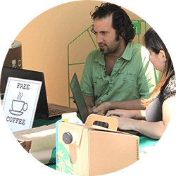
To recruit a diverse group of students, we set up a table in the Richter library lobby on two days in December 2016, once during the middle of the day and once in the early evening. Two library staff ran each test: one person guiding the test participant through the tasks, and the other observing and taking notes. Coffee was offered as an incentive to participate (it was close to finals, after all!). Altogether, we had 22 students participate, each of whom completed three of our test scenarios. Each test took between 5 and 10 minutes.
The tasks and questions we asked focused on how students use the library website to access resource, find out about library services, and use the library to meet their needs. Some of what we discovered was not a surprise: students don’t always understand library jargon, and often aren’t aware of the complete range of services offered by the library. Other things we discovered were more unexpected: students like being able to ask for help, often saying that they would just go ask the front desk rather than use the website for some tasks.
Some of the key recommendations that emerged from these tests were:
- Students’ use of the library website is primarily task-oriented, and they like the library homepage to be a center for their most commonly needed tasks.
- Students want information and services to be available to them at the time they need it, so the website should optimize connections between services and connect to other systems students use (e.g. Blackboard).
- Promote library services and expertise (i.e. people) on the homepage, because students are often unaware of what the library can offer them and do not explore the website beyond their immediate needs.
- Provide easy ways for students to communicate with library staff on the website.
For complete test questions and results, check out the One-on-One User Testing Discovery Report.